Edit: Since this post, I've created an interactive tool for binary visualisation - see it at binvis.io
In my day job I often come across binary files with unknown content. I have a set of standard avenues of attack when I confront such a beast - use "file" to see if it's a known file type, "strings" to see if there's readable text, run some in-house code to extract compressed sections, and, of course, fire up a hex editor to take a direct look. There's something missing in that list, though - I have no way to get a quick view of the overall structure of the file. Using a hex editor for this is not much chop - if the first section of the file looks random (i.e. probably compressed or encrypted), who's to say that there isn't a chunk of non-random information a meg further down? Ideally, we want to do this type of broad pattern-finding by eye, so a visualization seems to be in order.
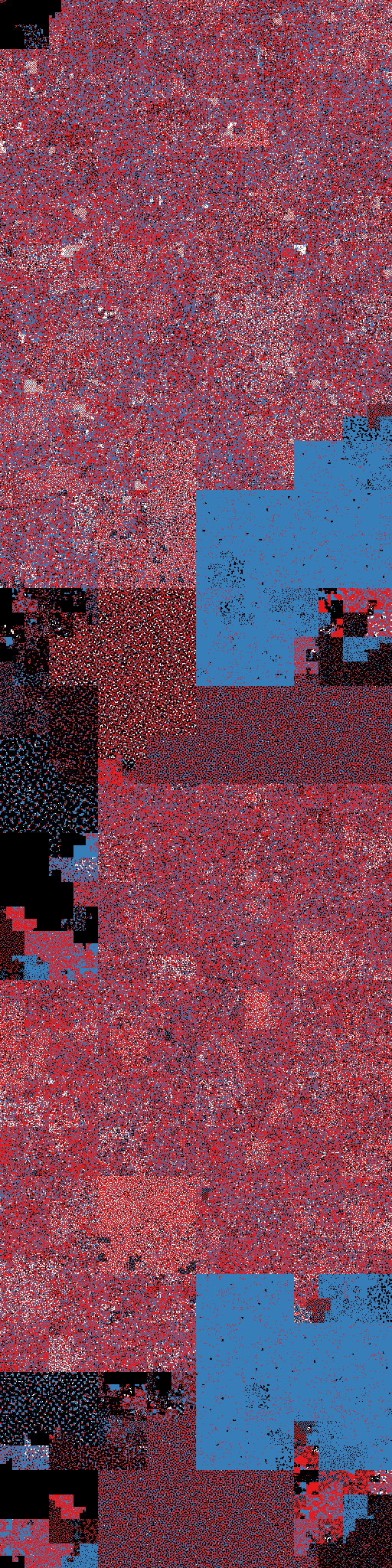
First, lets begin by picking a colour scheme. We have 256 different byte values, but for a first-pass look at a file, we can compress that down into a few common classes:
| 0x00 | |
| 0xFF | |
| Printable characters | |
| Everything else |
This covers the most common padding bytes, nicely highlights strings, and lumps everything else into a miscellaneous bucket. The broad outline of what we need to do next is clear - we sample the file at regular intervals, translate each sampled byte to a colour, and write the corresponding pixel to our image. This brings us to the big question - what's the best way to arrange the pixels? A first stab might be to lay the pixels out row by row, snaking to and fro to make sure each pixel is always adjacent to its predecessor. It turns out, however, that this zig-zag pattern is not very satisfying - small scale features (i.e. features that take up only a few lines) tend to get lost. What we want is a layout that maps our one-dimensional sequence of samples onto the 2-d image, while keeping elements that are close together in one dimension as near as possible to each other in two dimensions. This is called "locality preservation", and the space-filling curves are a family of mathematical constructs that have precisely this property. If you're a regular reader of this blog, you may know that I have an almost unseemly fondness for these critters. So, lets add a couple of space-filling curves to the mix to see how they stack up. The Z-Order curve has found wide practical use in computer science. It's not the best in terms of locality preservation, but it's easy and quick to compute. The Hilbert curve, on the other hand, is (nearly) as good as it gets at locality preservation, but is much more complicated to generate. Here's what our three candidate curves look like - in each case, the traversal starts in the top-left corner:
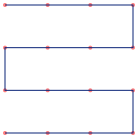
Zigzag
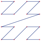
Z-order
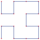
Hilbert
And here they are, visualizing the ksh (Mach-O, dual-architecture) binary distributed with OSX - click for the significantly more spectacular larger versions of the images:
Zigzag

Z-order
Hilbert
The classical Hilbert and Z-Order curves are actually square, so for these visualizations I've unrolled them, stacking four sub-curves on top of each other. To my eye, the Hilbert curve is the clear winner here. Local features are prominent because they are nicely clumped together. The Z-order curve shows some annoying artifacts with contiguous chunks of data sometimes split between two or more visual blocks.
The downside of the space-filling curve visualizations is that we can't look at a feature in the image and tell where, exactly, it can be found in the file. I'm toying with the idea (though not very seriously) of writing an interactive binary file viewer with a space-filling curve navigation pane. This would let the user click on or hover over a patch of structure and see the file offset and the corresponding hex.
More detail
We can get more detail in these images by increasing the granularity of the colour mapping. One way to do this is to use a trick I first concocted to visualize the Hilbert Curve at scale. The basic idea is to use a 3-d Hilbert curve traversal of the RGB colour cube to create a palette of colours. This makes use of the locality-preserving properties of the Hilbert curve to make sure that similar elements have similar colours in the visualization. See the original post for more.
So, here's a Hilbert curve mapping of a binary file, using a Hilbert-order traversal of the RGB cube as a colour palette. Again, click on the image for the much nicer large scale version:
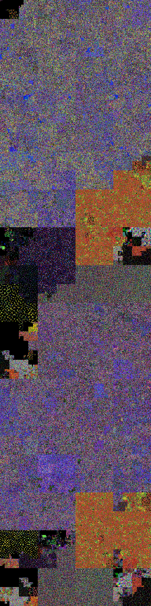
This shows significantly more fine-grained structure, which might be good for a deep dive into a binary. On the other hand, the colours don't map cleanly to distinct byte classes, so the image is harder to interpret. An ideal hex viewer would let you flick between the two palettes for navigation.
The code
As usual, I'm publishing the code for generating all of the images in this post. The binary visualizations were created with binvis, which is a new addition to scurve, my space-filling curve project. The curve diagrams were made with the "drawcurve" utility to be found in the same place.