Malware
05 January 2012
If you subscribe to my RSS feed, please visit this article directly. The table below has interactive elements that won't work in most feed readers.
Hover and click for more.
|
|
|
|
|
|
|
|
|
|
|
|
|
|
|
|
|
|
|
|
|
|
|
|
|
|
|
|
|
|
|
|
|
|
|
|
|
|
|
|
|
|
|
|
|
|
|
|
|
|
The images above are entropy visualizations of samples from a malware database - black is zero entropy, with colour ranging through blue, up to hot pink for maximum entropy. Large areas of very high entropy are usually sections that are packed - encrypted or obfuscated by the malware authors to make the malware hard to detect and reverse engineer. Smaller areas might be keys, passwords, or other chunks of data meant to be hidden from view.
When you hover over an image, you see a character class visualization with the following colors:
| 0x00 | |
| 0xFF | |
| Printable characters | |
| Everything else |
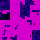
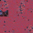
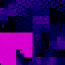
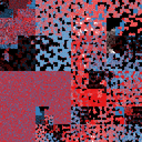
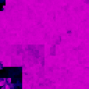
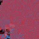
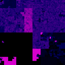
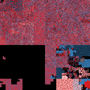
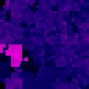
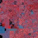
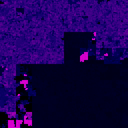
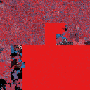
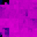
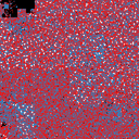
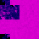
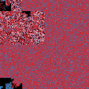
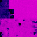
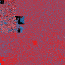
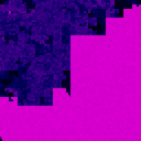
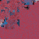
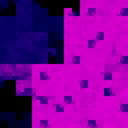
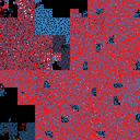
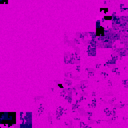
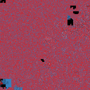
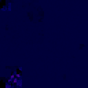
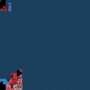
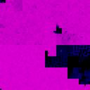
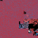
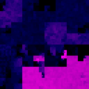
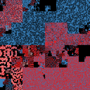
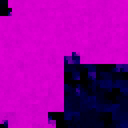
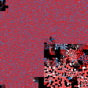
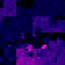
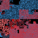
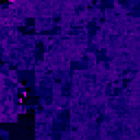
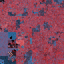
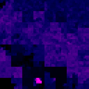
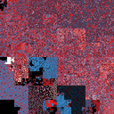
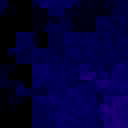
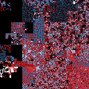
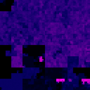
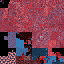
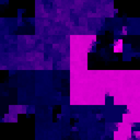
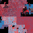
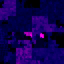
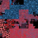
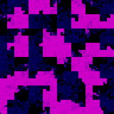
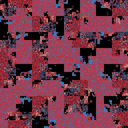
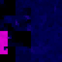
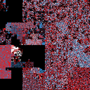
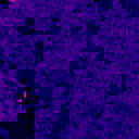
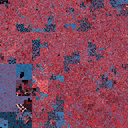
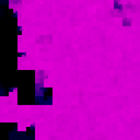
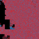
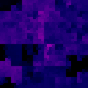
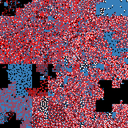
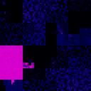
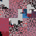
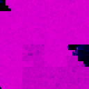
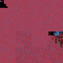
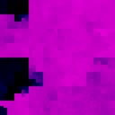
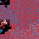
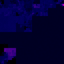
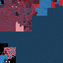
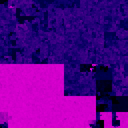
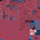
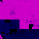
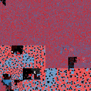
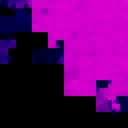
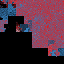
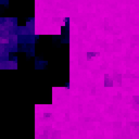
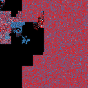
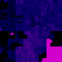
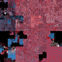
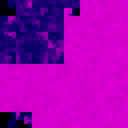
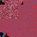
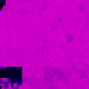
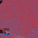
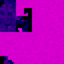
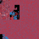
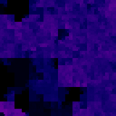
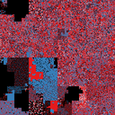
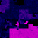
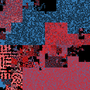
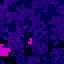
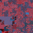
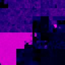
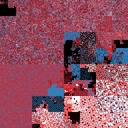
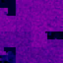
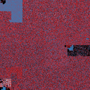
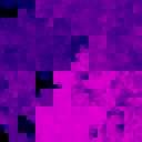
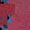
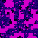
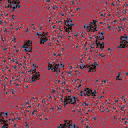
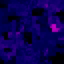
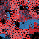
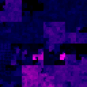
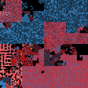
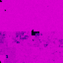
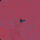
Clicking will show you high-detail versions of both visualizations, and let you look up the binary hash to see what it is. I've used a square Hilbert curve layout - the files start in the top-left corner, and pass through the quadrants clockwise.
I spent hours looking through thousands these visualizations today. I find them eerie and rather beautiful - an entirely different perspective from my day-to-day interactions with malware.
Related:
- Visualizing entropy in binary files 04 Jan 2012
- Visualizing binaries with space-filling curves 23 Dec 2011
- Generating colour maps with space-filling curves 07 Jan 2010
- Portrait of the Hilbert curve 03 Jan 2010
- Hilbert Curve + Sorting Algorithms + Procrastination = ? 26 Jan 2010
More posts:
- Introducing pathod: a pathological HTTP server 01 May 2012
- mitmproxy 0.8 09 Apr 2012
- mitmproxy 0.7 27 Feb 2012
- OpenBSD in decline? 26 Feb 2012
- mitmproxy 0.6 07 Aug 2011
- mitmproxy 0.5 27 Jun 2011
- How UDIDs are used: a survey 19 May 2011
- De-anonymizing Apple UDIDs with OpenFeint 04 May 2011

