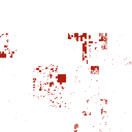
I'm spending a fair bit of my time working on a project that uses an IP geolocation database to map internet addresses to countries as part of a security survey. There are a number of these location databases available, but comparing their quality and coverage is not trivial, so selecting one to use is hard. I recently decided to spend a few hours looking at the problem, and got hopelessly side-tracked into visualising the databases using the Hilbert curve. The result is the Hilbert Explorer, a mapping of the geographical location of IP addresses onto the Hilbert Curve. You should have a play with it before reading the rest of this post.
The Hilbert Curve - a (very) brief introduction
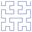
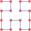
The Hilbert Curve is a space-filling curve that is usually produced iteratively, with the N-th step in the iteration referred to as the "order N" curve. Here are orders 1 to 5:
 N=1 |
 N=2 |
 N=3 |
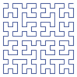 N=4 |
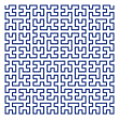 N=5 |
To translate from one order to the next, we simply replace U-shapes like the the N=1 diagram with Y-shapes like the N=2 diagram. So, in the N=1 diagram there is a single U to be replaced, in the N=2 diagram there are 4 U-shapes (two at the top, oriented left and right, and two at the bottom oriented down). Each subsequent order has 4 times the number of U shapes the previous one had, so for N=3 we have 16 replacements to do, and so on and so forth.
Mathematicians are interested in the behaviour of the limit curve as N approaches infinity - luckily the properties of the curve that are interesting to computer scientists manifest well short of that. For the purposes of this post, we can view the order-N curve simply as a way to lay out a sequence of 2**2N items on a plane, with the rather interesting property that items that are near each other in the sequence are also near each other on the plane:
The recursive construction above is a nice way to explain the curve, but doesn't lead to an efficient way to actually draw it. For this I turned to Henry S. Warren's wonderful Hacker's Delight, one of those books that I return to again and again. If you don't already own a copy, just buy it - you won't be disappointed. All the images in this post and in the Explorer were drawn with PyCairo using the algorithm for calculating co-ordinates from the distance along the curve given in section 14.4 of this book.
Visualising IP Geolocation
Mapping IP addresses to countries is a tricky affair. Control of any given address filters down from IANA to the regional registries, from regional registries to national and local registries, and from there to a myriad of private and government organisations. Here, horse-trading and private enterprise takes over and IP blocks are sold, traded and routed arbitrarily, with the consequence that any given IP might actually be located in geographical area totally unrelated to the controlling organization or even the registry region. A number of companies now offer geolocation databases at various prices, some of them for free. The databases themselves typically contain more than 100,000 subnets, usually spanning something like two billion actual addresses. I had about half a dozen of these databases to compare, and, being a visual creature, I wanted to see what I was dealing with. I've been fascinated with the Hilbert curve for a long time, but I first came across the idea of using it to visualise the entire IPv4 address space in Randall Munroe's excellent hand-drawn map of the Internet. After this was published in 2006 a slew of more detailed visualisations appeared, including at least one on a 1:1 scale.
We can map X points of data onto a discrete Hilbert curve of order lb(X)/2, so the order 16 Hilbert curve would suffice to display all 2**32 IP addresses at a one-to-one scale. To produce a more manageable image size, I used an order 9 Hilbert curve producing a 512x512 pixel image, where each pixel represents a bucket of 16384 addresses. I then rendered a series of transparent PNG layers - one showing all addresses in the database, and a set of overlays showing the addresses in each country and some "landmarks" like the RFC1918 addresses. The result looks something like the image at the head of this post. To make the visualisation more interactive, I bolted things together with a bit of Javascript to let me easily switch between countries, and to show IP addresses when hovering over the image. You can find the resulting visualisation for one of the freely-available geolocation databases - WorldIP - here:
Hilbert Explorer
I'll stop there for now, and leave the actual database comparison and a deeper exploration of the related issues for future posts.