Update See sortvis.org for many more visualisations!
I dislike animated sorting algorithm visualisations - there's too much of an air of hocus-pocus about them. Something impressive and complicated happens on screen, but more often than not the audience is left mystified. I think their creators must also know that they have precious little explanatory value, because the better ones are sexed up with play-by-play doodles, added, one feels, as an apologetic afterthought by some particularly dorky sportscaster. Nevertheless I've been unable to find a single attempt to visualise a sorting algorithm statically (if you know of any, please drop me a line).
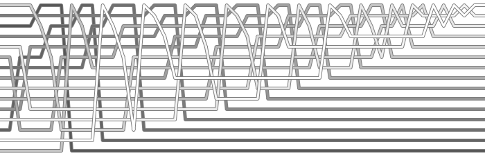
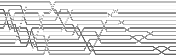
So, presented below are the results of a pleasant evening with some nice Scotch and the third volume of Knuth. First, here's a taster - a static visualisation of heapsort:
I think these simple static visualisations are much clearer than most animated attempts - and they have the added benefit of also being, to my not entirely unbiased eye, rather beautiful. You will find more visualisations, source code, and a tediously long explanation of why I bothered, after the jump.
The Problem
Before I go on, though, bear with me while I press home my point about animation with a particularly heinous example of the genre. I found the following specimen on the Wikipedia page for Bubblesort:
Now, it is my measured opinion that this animation has all the explanatory power of a glob of porridge flung against a wall. To see why I say this, try to find rough answers to the following set of simple questions with reference to it:
- After what percentage of time is half of the array sorted?
- Can you find an element that moved about half the length of the array to reach its final destination?
- What percentage of the array was sorted after 80% of the sorting process? How about 20%?
- Does the number of sorted elements grow linearly or non-linearly with time (i.e. logarithmically or exponentially)?
If you thought that was harder than it needed to be, blame animation. First, while humans are great at estimating distances in space, they are pretty bad at estimating distances in time. This is why you had to watch the animation two or three times to answer the first question. When we translate time to a geometric length, as is done in any scientific diagram with a time dimension, this estimation process becomes easy. Second, many questions about sorting algorithms require us to actively compare the sorting state at two or more different time points. Since we don't have perfect memories, this is very, very hard in all but the simplest cases. This leaves us with a strangely one-dimensional view into an animation - we can see what's on screen at any given moment, but we have to strain to answer simple questions about, say, rates of change. Which is why the final question is hard to answer accurately.
Finding Flatland
It turns out that it is pretty easy to find a static, two-dimensional encoding for the sorting process. The specific technique used here only works when the sorting algorithm is in-place, i.e. does not use any storage external to the array itself. Some of the algorithms below have been slightly modified from their standard forms to make sure they have this property. The magnitude of a number is indicated by shading - higher numbers are darker, and lower numbers are lighter. We begin on the left hand side with the numbers in a random order, and the sorting progression plays out until we reach the right hand side with a sorted sequence. Time, in this particular case, is measured by the number of "swaps" performed. This means that all swaps are equidistant on the diagram, and that only a single swap occurs at any point in time. When I refer to "time" when talking about these diagrams, I am therefore not referring to clock time.
Now, I should be clear at the outset that I haven't tried to pack these diagrams with as much information as possible. For example, I don't include tick marks for time units, nor do I explicitly mark algorithm details like Instead, I've simply tried to produce images that give a clear sense of the "flow" over time of the algorithms, while simultaneously not being an eyesore. I might produce some scaled-up annotated versions of the diagrams for some future post.
Bubblesort

So, lets start with a static visualisation of bubblesort. Notice that, even without any labelling, we can "read off" the answers to all the questions posed above pretty trivially:
- The sorted portion of the sequence is clearly visible as a triangular block in the bottom-right of the image, so we can easily locate the point at which half the array is sorted, and read off the percentage of time taken.
- Since the start and end positions of each element is visible on the graph, finding an element that moved about 50% of the length of the array is simple.
- Similarly, the percentage of the array that is sorted at 20% and 80% of the process can just be read off.
- Lastly, we can clearly see that the curve of sorted elements is not linear, but is probably close to n^2.
Other features of the algorithm are also clearer - for instance, the famous "rabbits" and "turtles" are clearly identifiable. In the diagram the "rabbits" are the dark lines sweeping down to their positions rapidly, and the turtles are the lighter lines that gradually curve towards the top right of the image.
Heapsort
Now, lets return to the heapsort image at the top of this article. First, a quick (and superficial) refresher on the algorithm itself:
- Step 1: Arrange the elements in the array to form a "heap" - a data structure that allows us to find the largest element in constant time.
- Step 2: Peel off the largest element, and move it to below the heap.
- Step 3: The heap is now disrupted, so we do some work to re-establish the heap property.
- Step 4: Repeat steps 2-3 until the entire array is sorted.
Looking at the visualisation, we can see Step 1 clearly - it is the portion of the diagram before the point where the largest element in the array is slotted into place. After that, we can see a repeated pattern - the heap is re-established and the greatest element is moved to below the heap again and again util the array is sorted.
We can immediately make some quite sophisticated observations. For example, we can see that although initially establishing the heap is costly, re-establishing it after the greatest element is removed requires an approximately constant amount of time throughout the sorting process - meaning that the time required is relatively independent of the number of items still in the heap. This is an interesting property that is not immediately obvious from an analysis of the algorithm itself.
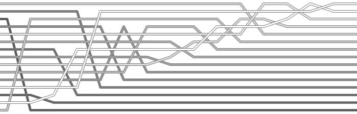
Right - enough prattling! Here is a selection of other visualised algorithms for your viewing pleasure:
Quicksort

Selection Sort
Insertion Sort
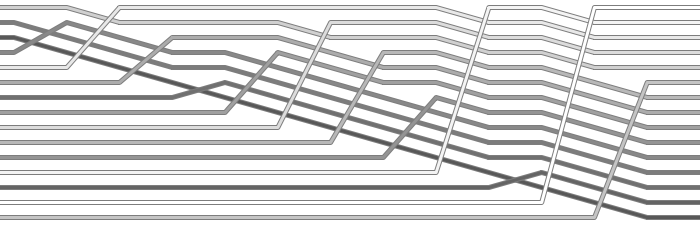
Shell Sort
The Code
This whole thing started partly as an excuse to get familiar with the Cairo graphics library. It produces beautiful, clean images, and appears to be both portable and well designed. It also comes with a set of Python bindings that are maintained as part of the project itself - a big plus in my books. Firefox 3 will use Cairo as its standard rendering back end, which will instantly make it one of the most widely used vector graphics libraries out there.
The examples on this page were generated using a command somewhat like the following:
./visualise.py -l 6 -x 700 -y 300 -n 15Update 9/8/09: A newer version of the code is now available on github. You can check it out like so:
git clone git://github.com/cortesi/sortvis.git