I've had a nagging sense of dissatisfaction with my information diet lately, and it's becoming clear that over-reliance on social news sites like Reddit and Hacker News (much as I love them) lies at the heart of my discontent. For the past few months, I've been gathering data to help me come up with a coherent explanation for my malaise. I'm still working on it, so this post will have no conclusions, only repulsive metaphors and pretty pictures.
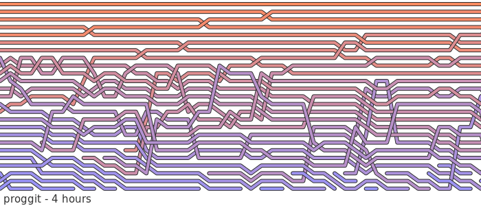
For a week or so in November I logged the slow, peristaltic progress of stories through the bowels of proggit, watching them get nudged this way and that by the malodorous, hot gas of public opinion before finally being shunted on to the colon of the second page of results. In other words, I sampled the top 25 stories every 5 minutes through the RSS feed. One of the things I was interested in was how submission rankings changed over time, so I visualised the dataset using the same technique I came up with to visualise sorting algorithms. The image above shows 4 hours of proggit, with each submission represented by a line. The lines are coloured based on the average rank the story achieves over its lifetime in the top 25, ranging between upvote orange for top stories, and downvote blue for bottom stories.
Here's a bigger sample - 72 hours of data embedded in a widget to let you zoom and pan around. The busy cut-and-thrust of life on reddit is all here. The meteoric rise, inevitably followed by long, slow decay. The sudden, mysterious, mid-flight disappearances. The jostling and writhing among the bottom submissions that never quite manage to make it into the big leagues. Heady stuff. Click to view:

Perhaps I'll do an expanded version that lets you view submission titles, times and so forth later on.