A couple of days ago I published a set of explosion-in-a-crayola-factory colourful sorting algorithm visualisations, using a colour sequence generated with the Hilbert curve. The idea was that using a space-filling curve to traverse the RGB colour cube we could get a large number of distinct but visually ordered colours. I contrasted this with a more common method, which is to vary the intensity of a monotone to generate a gradient of colours. A couple of people suggested that I provide a set of grayscale images for comparison. I was curious about this too, so I hacked a grayscale generator into sortvis. The results were striking, but not interesting enough to reproduce here in full. Subjectively, I think the coloured images do allow you to follow more of the detail in these dense visualisations, but I'm not wedded to the idea. Being able to visually judge the order of elements in a sorting algorithm visualisation is important, and that is something we sacrifice in the Hilbert RGB traversal. I still like my earlier sparse grayscale visualisations best.
If you're curious, you can check out sortvis and generate the full set of grayscale graphs with the following command:
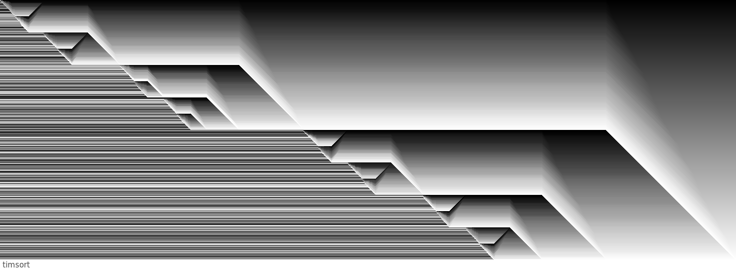
./dense -g -n 512I did think the grayscale version of Python's Timsort was worth sharing. It's pretty spectacular due to a purely coincidental 3d effect - not much good for explaining Timsort, but I'd hang it on my wall, for sure.