I recently wrote a series of posts using the Hilbert curve to visualize binaries, culminating in a gallery showing regions of high entropy in malware.
The fact that the Hilbert curve has excellent locality preservation means that one dimensional features are preserved (as much as they can be) in the two-dimensional layout. This lets us visually pick out features of interest, and makes it possible, for instance, to quickly identify different malware packers just based on their layout characteristics.
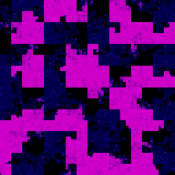
An obvious next step is to ask if it's possible to extend this idea to let us visually compare binaries, creating a sort of visual diff. Unfortunately, we now bump our heads against the limitations of space-filling curve visualization. I made the animation below after a recent conversation along these lines, and I think it illustrates the main issues nicely. It shows a single contiguous stretch of data (the black area) being shifted progressively through a binary. At each timestep, the only thing that changes is the starting location of the data block:

Two things are immediately clear:
- The block of data doesn't retain its shape at different offsets - identical stretches of data can look totally different depending on their locations.
- There's no way to quickly see where in the binary a piece of information lies. Unless you are very familiar with the particular curve and know its exact orientation, you can't say, for instance, when the data block lies a third of the way through the binary.
It's often worthwhile to trade off these things for locality preservation, but it definitely scotches certain use cases. I do wonder if it might be possible to tune the trade-off somewhat - sacrificing some locality preservation for better shape retention and offset estimation. I've toyed with some ideas along these lines (see the unrolled layouts in the binary visualization post), but I still don't have a satisfying solution. If anyone out there knows of one, drop me a line.